# Lesson 24: Styling the skip link
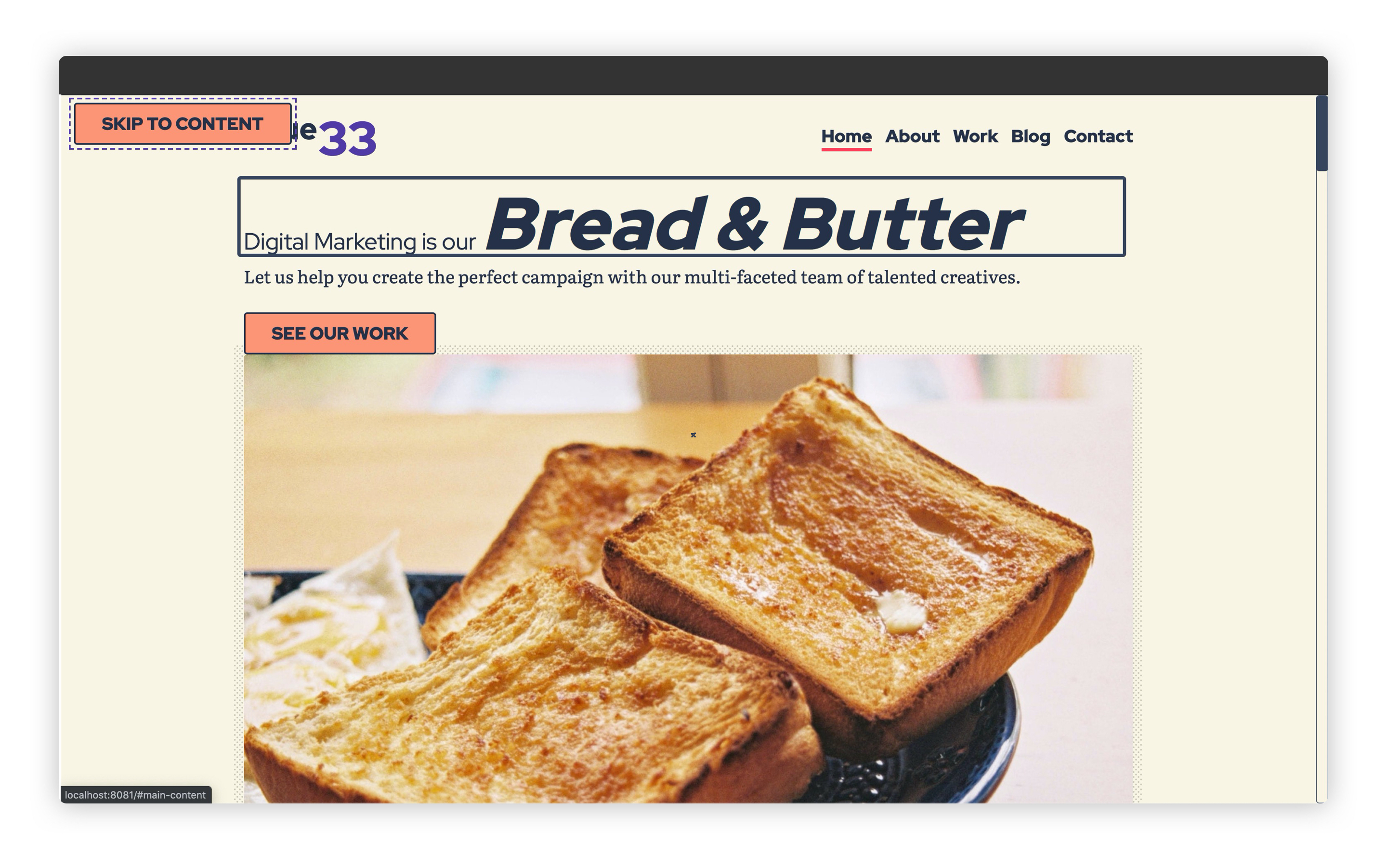
A skip link allows a user to skip past the header and navigation and jump straight to the <main> element. At the moment, ours is very visible, but we’re going to visually hide it until it is focused.
When it’s focused, it’ll look the same as the buttons on the site, so the first thing we’ll do in this lesson is style those.
# Styling our site’s buttons
Create a new file in your blocks folder called _button.scss and add the following to it:
.button {
  @extend .radius;

  display: inline-block;
  padding: 0.5rem 2rem;
  background: get-color('quaternary-glare');
  color: get-color('dark-shade');
  border: 2px solid;
  text-transform: uppercase;
  text-decoration: none;
  text-align: center;

  @include apply-utility('font', 'sans');
  @include apply-utility('weight', 'bold');

  // Make sure hover state trumps all variants with a good ol’ important
  &:hover {
    background: get-color('quaternary') !important;
    color: get-color('dark-shade') !important;
  }

  // Add a ghost modifier
  &[data-variant='ghost'] {
    background: transparent;
    color: get-color('quaternary-glare');
  }
}
Hopefully the references to get-color, and apply-utility are pretty recognisable to you now. They’re allowing us to apply design tokens that are set in _config.scss. As you can also see, a lot of this block is actually made up of tokens.
This is just another way of applying tokens to an element and, luckily, Gorko (opens new window) supports both ways seamlessly for us. Applying the different utilities on a button—especially with interactive states—would be suboptimal.
A couple of things to mention is that we’re using a Sass @extends here. These are absolutely fine, but use them with care. If you’re not careful, your Sass can generate a lot of extra selectors which can really bloat your CSS.
Lastly, we’re using !important on the hover state, too. The reason for this is that we’re dealing with two button variants: the normal .button and the exception, .button[data-variant="ghost"]. Because the exception has a higher specificity than the .button and the hover state, it actually makes a lot of sense to give the hover state a boost with an !important. Again, use these with care.
# Styling the skip link
Now we have our button styles, we can style the skip link. This block is tiny, but hella powerful. Let’s add it.
Create another file in your blocks folder called _skip-link.scss and add the following to it:
.skip-link {
  position: absolute;
  top: get-size('400');
  left: get-size('400');
  z-index: 99;

  // @extends should be used with care, but this is a great example of them being hella useful
  &:not(:focus) {
    @extend .visually-hidden;
  }
}
We’ve already applied the .button class to our skip link in base.html, but what we also needed to add was that specific block style.
That starts with making the button absolute. Setting position: absolute pulls an element out of the document flow, meaning that wherever it finds itself, it will no longer affect any of its surrounding elements. We’ve done this to make sure it sits in the top left.
Then, the real magic happens. This is the sort of thing that I love about Sass. We make the skip link extend the existing .visually-hidden utility only when it isn’t focused. This means that when it’s not focused, only screen reader users can “see” it, but when it’s focused, everyone can see it!
TIP
The visually hidden utility is really useful because using display: none or visibility: hidden actually hides elements from screen reader users. The CSS that we write in the visually hidden utility fixes this by using clip and position: absolute to achieve the same visual result, while maintaining a valid accessible result.
You can see this utility in eleventy-from-scratch/src/scss/utilities/_visually-hidden.scss.
# Wiring it all up
Just like in the last lesson, we need to import this CSS, so open up eleventy-from-scratch/src/scss/critical.scss and add the following, with the other block @import statements:
@import 'blocks/button';
@import 'blocks/skip-link';
Now when you open up http://localhost:8080 (opens new window) and press the tab key, it should look like this:

# Wrapping up
The skip link is an accessibility power tool and you could certainly take this knowledge and apply it to other projects.
Let’s move on and have some fun with CSS Grid!